Login
Join
Contact
-
COLOUR ME BEAUTIFUL
Infusing your life with vibrant hues opens the door to a whole new kind of magic, as Julia Green has discovered.Whether you are a colour lover or pick from a minimal palette, whether your preference is for Scandi or coastal style, or even if it’s a mishmash of themes, interiors have never been more personalised than they are right now.
And yet, trends are a reality that affect all parts of our cultural life. There are no hard and fast rules when it comes to styling your space, but what is true is that every era – actually, every design and fashion season – brings its own influences. Some endure longer than others, but who knows what will prove to be a classic and what is nothing more than a flash in the pan? Oh, to have a crystal ball. In the end, regardless of the trend of a moment or even decade, only you can be the one to decide if a colour stays or goes.
Even though I have my favourite go-to colours and combinations, I am always interested in new trends. I get a kick out of thinking about their application and their companion or contrast colours. I like to ponder what colours we can expect to dominate interiors, but that interest does not always have to translate to application. It’s OK for trends to simply be admired from afar.
What about classics? Although it can be hard to predict the future – but inevitable we will rework the past – there are some foolproof combinations that stand the test of time. Classical black-and-white stripes have never dated and likely never will. French navy and cream feel timeless as well as elegant, as does a trusted duck-egg blue, which lends itself to be paired with other fresh pastels or bold brights that happen to come or go over time. All these combinations are considered good neutrals too. They are bound to go with whatever the new trend happens to be and are what you would call a safe choice.
With the inevitable overlap between fashion and interiors, it makes sense to look to the catwalks for colour forecasts and predictors of colour trends. Given the emergence of COVID-19, though, and the unprecedented amount of armchair travel as opposed to real-time travel, it will be interesting to see what impact this has globally for future colour predictions.
The popularity of stylised florals and bold African patterns in fashion means that these same combinations and clashes of bright colours will likely find their way into homes before long. These trends are also apparent in the art scene. Large oversized floral compositions and serene captures of botanicals will power on, adding signs of life to interior spaces and walls by linking the outdoors to inside.
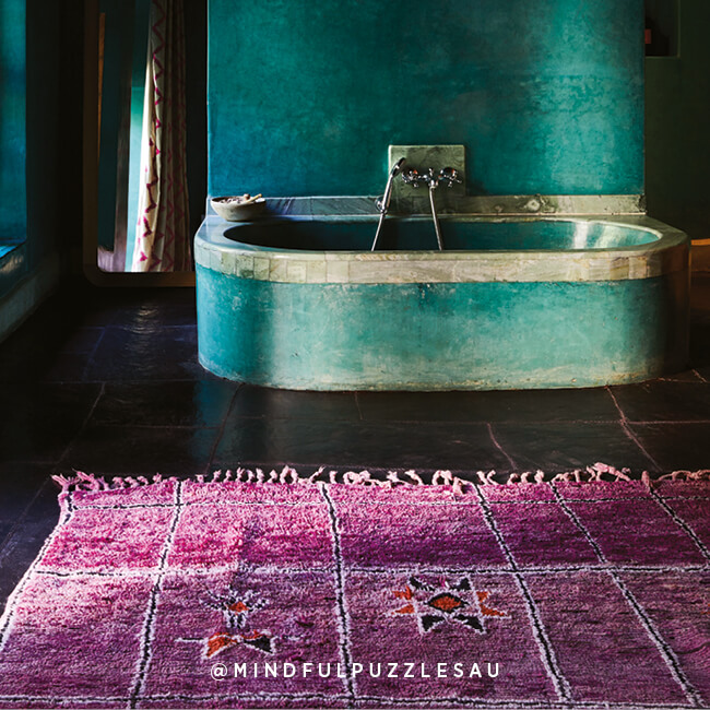
In terms of colours, it is a sea-inspired palette that I expect to have a strong influence soon. As people strive to disconnect from the distractions of their busy lives and become lost in their own peaceful surrounds, all shades of calming blue and green will have a place in contemporary interiors.
Like anything style related, interior trends are, of course, subjective. While some may embrace eclectic patterns and palettes with enthusiasm, others may introduce them gently. Don’t be afraid to add a little bit of daring and individuality to the interior mix – it doesn’t have to be permanent. Trends will come and go, and if you don’t love it, you won’t want to live with it. Draw on what speaks to you.
FOLLOW THE RAINBOW BRICK ROAD
The beauty of colour is certainly always in the eye of the beholder. Its subjective nature means that what one person likes, another won’t. Once you have nutted out what colours are right for you, it’s a matter of where and how to add them into the mix. Here are some tips to get you started.
FIND YOUR COLOURS
Colour, and how much you use it, is entirely personal. There is no right or wrong, but the key is to commit to it.
Try using variations of your colour choices as accents throughout a home to create a considered and unified look; for example, if blue is a key colour in your interior, you can continue the palette with teals and greens. Further visual appeal can also be achieved by incorporating textured fabrics and finishes – linen, timber, or stone can all diversify a consistent aesthetic.
Of course, contrasting colours can create even more visual interest. If you are not confident to mix colour combinations, colour authority Pantone has created an app, My Pantone, which does it for you. It takes the science out of colour selections and offers advice on complementary colour schemes.
UNDERSTAND INDUSTRY TERMS
Terms such as tint, tone, and shade are regularly referred to when discussing all things colour. It’s worthwhile getting to know what these terms mean. That way, you’ll have a better understanding of applying colour in all its forms to your interiors.
Essentially, tints, tones, and shades refer to the variations in colour when white, black, or grey are mixed in.
A tint is a lighter version of a colour, created by adding white, and can be quite calming. Pastels are a good example of this.
A shade is a darker version of a colour, created by adding black. Navy – the result of adding black to blue – is a classic shade.
Tones denote the addition of both black and white (grey) to a colour and can be darker or lighter than the original hue depending on the proportions of grey added. Often referred to as muted tones, these hues are more subtle than tints and shades.
TAKE YOUR TIME
If you are a little afraid of colour, go slow, go small. Add measured amounts of it to start with and live with it for a while before deciding on how much more to add or subtract.
As you grow in confidence and you learn what works for you and what doesn’t, you’ll be waving your colour wand with authority.
HAVE A PLAN
Before you start, think about the mood you want to create in each space. For instance, if you are after peace and tranquillity in the bedroom, avoid bright colours. Colour can turn the volume up or down, so use it to your advantage.
ALLOW COLOUR TO POP
Think about going for dark walls rather than white. While a white wall will certainly provide contrast for bold colours that are used throughout your furnishings and decor, and have a fresh feel, a moody hue will showcase colour even better.
VARIATIONS OF HUE
If colour mixing isn’t your thing, it can be equally as effective to stick with a single hue. If you prefer just one colour, try using it in different shades for maximum impact. For instance, a graduated ombre effect can be very striking and is always complementary.
TIMELESS COMBINATIONS
If you feel bright colours are a bit too much for you, opt for more timeless combinations such as black and white, which still pack a punch decoratively and tend not to date.
TRY SOMETHING NEW
While tried-and-true colour combinations do work supremely well, at times something more imaginative is called for. In fact, more unexpected combinations can work incredibly well, and often a soft mixed with a bold packs some extra punch; think terracotta teamed with cobalt, or teal mixed with mustard. One of my go-to combinations is a soft duck-egg blue and a punchy chartreuse – this is a surprising combination that seriously rocks my world. It’s all about these hues being total opposites – and opposites attracting. I need only think of one of my favourite decor pieces, a two-toned velvet cushion, to be reminded of how well this unlikely duo works together.
TRIPLE TREAT
Art is a wonderful focal point with which to ground a space. You can make any room feel well thought out by pulling out colours from an artwork; that, in turn, will make your colour choices feel more cohesive. Then repeat that colour in three places for unison in the room.
This is an edited extract from Vivid: Style in Colour by Julia Green. Photography by Armelle Habib. Published by Hardie Grant Books, RRP $60. Available in stores nationally.
-
LOVATTS MEDIA'S MAGAZINES
Breathe is your body-and-soul guide to a happier, healthier life. Perfect for those needing to slow down and make time for themselves.
SUBSCRIBE
Mindful Puzzles is an engaging lifestyle magazine with a captivating array of bespoke puzzles, uplifting editorial and the chance to win premium prizes.
SUBSCRIBE LOVATTSMAGAZINES.COM.AU
Copyright 2014 Executive Assistant Network. All Rights Reserved.